Every marketer faces the challenge of creating easily digestible and engaging content. In the B2B tech industry, marketers often deal with advanced and intricate products or solutions, making it difficult to convey their value without resorting to technical language. This complexity can alienate potential clients who might not be familiar with the specific jargon, making it crucial for marketers in this industry to strike a balance between clarity and technical accuracy.
So how do you create a website experience that not only showcases technical prowess but also encourages visitors to take the desired action? The answer lies in understanding the intrinsic value of a well-designed website.
Special thanks to Kirill, our in-house UI expert, for providing valuable insights on B2B websites. We’ve distilled these insights into 3 key categories for improvement that can be the difference between a missed opportunity and a successful conversion.
- User-centric design
- Page load speed
- Navigational clarity
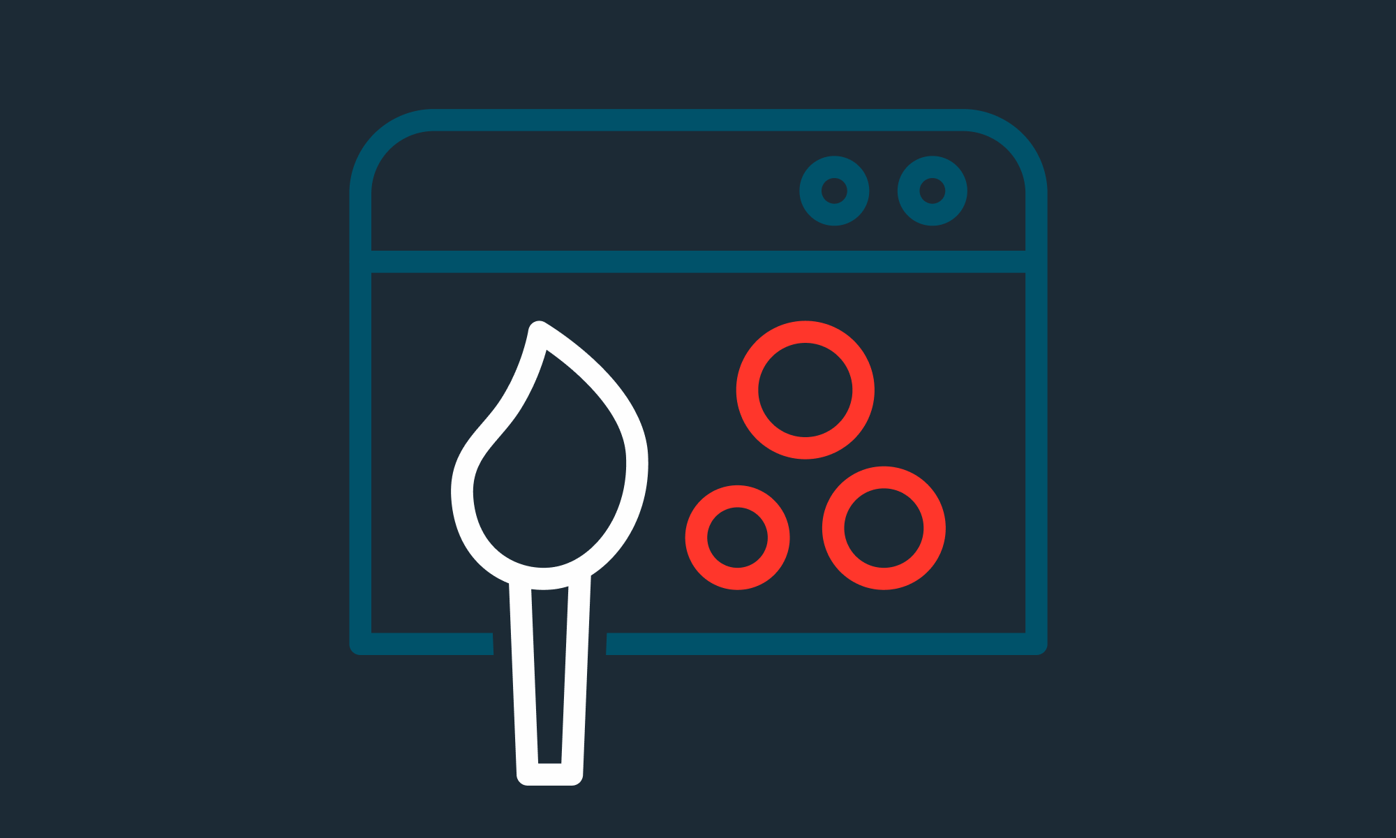
User-Centric Design: More Than Just Aesthetics
Design isn't just about aesthetics; it's a strategic tool that, when wielded correctly, can propel a company to new heights of revenue growth.
Let's take a closer look at important features to ensure your site not only has a great design but also operates well for everyone.
User Personas

Personas are like guides that help companies shape their content and design to fit what their audience wants. Think of them as detailed profiles of your ideal customers, highlighting their goals, challenges, habits, and what drives them. Using these profiles, companies can better connect with their audience, make the buying process smoother, and increase sales.
For tech companies selling to other businesses, the buying process often involves both the people who influence decisions and those who make the final call. That’s why it’s crucial that the content speaks to both groups. By really understanding and using these personas, businesses can make their websites match what users are looking for, making everything from content to features more effective
Using White Space
What’s the best way to ensure your content is easy to read? A clean, clutter-free design and clear navigation!

The use of such spaces is key as they provide visual breathing room for the eye, making content more digestible and the overall design more appealing.
Refining The User Journey
A well-structured website does more than just display information; it expertly steers visitors through a thoughtfully crafted journey. Starting with a homepage that captures the brand's core, to in-depth pages on offerings, every piece should be crystal clear and user-friendly. It's a no-brainer: your site must have sections dedicated to specific solutions and target markets. Key tabs like pricing, resources, and support are also important for a holistic user experience—they offer a full picture. Case studies and testimonials can serve as concrete evidence of capability and establish a foundation of trust. They're not just fluff; they're proof of your prowess!
Example of Notion's website design
For instance, Notion's website is recognized for its exceptional design and user journey for several reasons:
• Unified Workspace: The website promotes Notion as a "connected workspace for wiki, docs & projects," emphasizing its all-in-one functionality. This clear messaging helps visitors immediately understand the platform's value proposition.
• Clear Segmentation: The site breaks down its offerings into distinct sections. Each segment is accompanied by a brief description, making it easy for users to grasp the platform's capabilities.
• Visual Appeal: The website uses a clean and straightforward design, which enhances readability and user engagement.
• Testimonials: Real-world feedback from users adds credibility. These testimonials vouch for the platform's efficiency and highlight its adaptability to various needs.
• Engaging Descriptions: Phrases like "Simple. Powerful. Beautiful." and "Communicate more efficiently with next-generation docs" convey the platform's strengths in a concise manner.
In essence, Notion's website effectively combines clarity, design aesthetics, and user testimonials to create a compelling user journey, making it easier for visitors to understand and appreciate the platform's offerings.
Transition Animations
It's not just about static content. Animations transitioning from one section to another can organically enhance a visitor's interaction, making the user journey feel more fluid. Take, for instance, how Zenefits incorporates a mix of scrolling animations. From simple transitions to intricate on-scroll and parallax scrolling effects, these subtle touches elevate their website from average to exceptional.
Following this, the strategic use of white and negative space seamlessly integrates into the design, complementing any color scheme and drawing attention to crucial content.
Example of Zenefit’s website using an interesting and eye-catching combination of transition animations.
Optimizing Page Performance For Lower Bounce Rates
Integrating animations and illustrations can bring a dynamic touch to the site, making complex tech concepts more digestible. With multimedia taking center stage, it becomes a focal point, drawing users in and keeping them engaged. However, all these design elements mean nothing if your site lags. Remember, the probability of a visitor leaving increases by 32% if the page load time shifts from 1 second to 3 seconds. In the world of B2B tech, where every second counts, speed is of the essence.
Navigational Clarity for a Mixed Audience
B2B tech companies offer a wide range of products, from SaaS tools to complex PaaS systems. The real challenge? Making sure your website is easy to navigate for everyone, whether they're T-shaped marketers, high-level executives, or seasoned tech experts.
As established through user personas, you can understand that every visitor to your website comes with a unique set of expectations. A tech-savvy developer might delve into the nitty-gritty of platform integrations, while a business executive seeks a broader understanding of how a product can drive ROI. Catering to such a diverse audience requires a blend of clarity in content and simplicity in design.
Mega menus, with their expansive and organized layout, offer a bird's eye view of what the website entails, guiding both the expert and the novice seamlessly. Interactive elements sprinkled throughout the site can further enhance user engagement, making the exploration process intuitive and enjoyable.
However, it's not just about the content. True accessibility in design means ensuring that every user, irrespective of their technical background, feels welcomed and can easily access the information they seek. This involves optimizing for different devices, ensuring compatibility with screen readers, and even the subtleties of color contrasts for optimal readability.
While technical jargon is an integral part of B2B tech, it's essential to strike a balance. Clear explanations, paired with an inclusive UX design, ensure that the website is a beacon of information and accessibility. After all, in the competitive world of B2B tech, an inclusive digital presence can be the differentiator, turning curious visitors into loyal clients.
Drupal stands out for its versatile layout-building strategies, catering to various page assembly needs. A few of the most common visual design tools that work well with Drupal are Layout Builder, Site Studio by Acquia, and Paraghraphs. What sets Drupal apart is its prowess in component-based design, ensuring brand consistency across all communication platforms. Plus, with Drupal, you're never restricted; there's no cap on the number of menus you can create, offering unparalleled flexibility.
Let’s Recap
Every design choice you make has a ripple effect on your conversions. Each of these design recommendations, from tailoring content to user personas to ensuring a clutter-free layout, plays a pivotal role in nudging visitors toward the desired action. After all, conversions are the bread and butter of your revenue!
As you embark on your next design sprint, consider integrating these elements for maximum impact. And if you ever need a helping hand, remember, Symetris is always by your side, ready to assist.

